Change analysis
With SpotIQ change analysis, you can compare any two data points in a visualization for change and identify key change drivers from the underlying attribute columns.
SpotIQ change analysis compares data points of simple or complex measures using these aggregates:
-
Sum
-
Count
-
Sum over sum, which generates 'what-if' percentage insights
-
Average, which generates 'what-if' percentage insights
-
Other functions which use a 'versus' analysis to show the absolute change grouped by different drill attributes
Contextual change analysis
ThoughtSpot supports contextual change analysis for area, line, column, bar, line-column, donut, and KPI charts. You do not need SpotIQ privileges to run contextual change analysis.
To perform this analysis, follow these steps:
-
On an area, line, column, bar, line-column, pie, or KPI chart, hold down the command key (MacOS) or control key (Linux or Windows).
-
Select the two columns or data points you plan to compare.
Note that if you are analyzing a KPI chart, you must either click the percent change label or select two points from the sparkline visualization. You cannot run change analysis on a KPI chart with no sparkline visualization. -
Right-click to see the dropdown menu, and select Run change analysis.
-
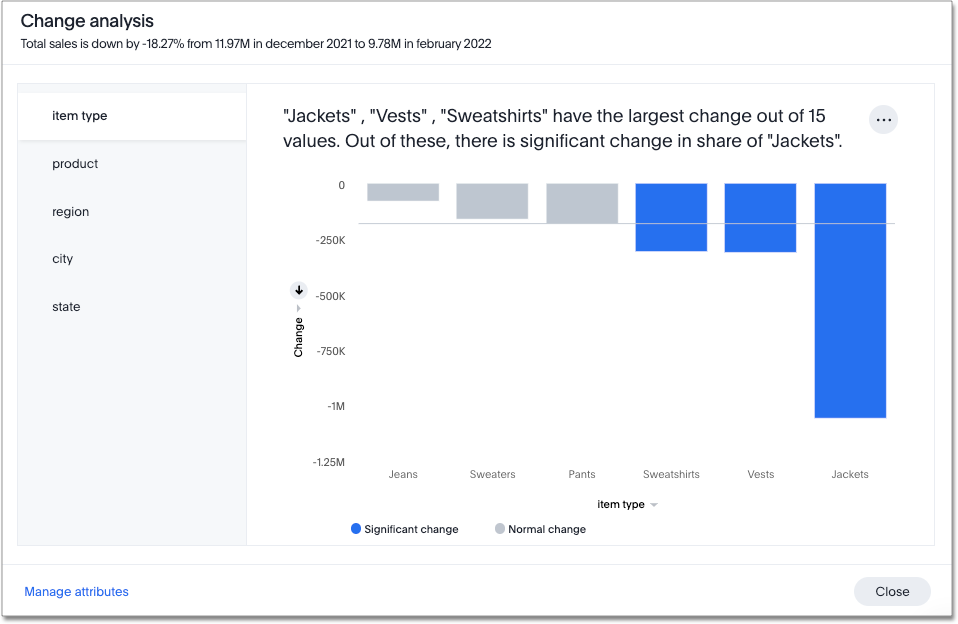
The SpotIQ window modal appears with the results of your analysis. By default, SpotIQ picks the top 5 most relevant columns, based on what it learned from your past activity.

To select other columns to analyze, click Customize attributes in the lower left corner of the window and select the desired column from the window that appears.
Each colored section of a SpotIQ insight represents a statistically significant outlier among the values of your chosen columns. For more information on how statistically significant outliers are calculated, see Z-scores. -
You can now examine each visualization of the analysis for details of comparison.
In some instances, ThoughtSpot may point out that certain attribute values account for more than 100% of the total change. This is generally for cases where attribute values contribute to a trend that is opposite to the total change (positive change when the overall trend is negative, for example). You may see cases, for example, where two attribute values account for a 300% increase in sales, while the remaining attribute values indicated account for 200% of the total decrease. -
You can add the specific visualization to an existing Liveboard, or create a new Liveboard and add it there.
-
You can run another round of SpotIQ analysis, download the data as a CSV file, edit this visualization, or make a copy of the visualization.
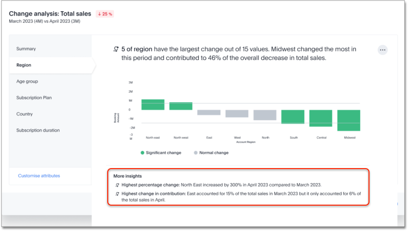
When you run SpotIQ change analysis, ThoughtSpot detects additional insights and displays them below the change analysis visualizations. These insights display values that underwent the highest percentage change between the data points defined in your analysis, and values whose share of the total changed the most. Note that insights do not appear for measures of type unique counts and ratios.

Remember personalized columns Early Access
Admin users with edit permissions on a Liveboard can set their preferred attribute columns through the change analysis window and select to keep those selections for any subsequent change analysis calculations on that Liveboard.
To set personalized attribute columns that will persist on the Liveboard, follow these steps:
-
. On an area, line, column, bar, line-column, pie, or KPI chart, hold down the command key (MacOS) or control key (Linux or Windows).
-
Select the two columns or data points you plan to compare.
Note that if you are analyzing a KPI chart, you must either click the percent change label or select two points from the sparkline visualization. You cannot run change analysis on a KPI chart with no sparkline visualization. -
Right-click to see the dropdown menu, and select Run change analysis.
-
The SpotIQ window modal appears with the results of your analysis. By default, SpotIQ picks the top 5 most relevant columns, based on what it learned from your past activity.
-
In the lower left corner of the SpotIQ window, select Customize attributes. Select your desired columns from the list that appears.
-
In the lower right corner of the Customize attributes window, click Apply to all users.
Individual users can still override these preferred columns on their own SpotIQ analysis by running the calculation and selecting Customize attributes.
Iterative change analysis Beta
You can now drill down on the results of change analysis to learn more about change drivers in your data.
To run iterative change analysis, follow these steps:
-
Select two points on a chart and right-click to select Run change analysis.
-
Right-click on an attribute value in the resulting change analysis and select Analyze <attribute_value>. For example, if you want to deep-dive to understand what’s driving change in "California" in "State" attribute, right click on "California" and click "Analyze California".
-
ThoughtSpot adds the specified attribute value as a filter and re-calculates change analysis for the original comparison points.
| Iterative change analysis does not work on visualizations created with custom calendars. |
Natural language narratives Early Access
ThoughtSpot generates insight narratives in natural language to summarize the data analyzed in SpotIQ. Admin users can enable natural language narratives by navigating to the Search and SpotIQ section of the Admin page and setting Natural language narratives for SpotIQ change analysis to Enabled. The narratives are generated by LLM, and appear above the charts created by SpotIQ.
How SpotIQ calculates outliers
Z-Score
A Z-score represents the number of standard deviations from the mean a data point is. Z-scores are a way to compare results from a test to a “normal” population. The basic Z-score formula for a sample is: z = (x – μ) / σ where
-
σ is the standard deviation
-
μ is the mean
-
x is the data value.
Currently, any value outside μ +/- N * σ (i.e. Z-score less than or greater than N) is an anomaly. N is determined based on the number of rows. It is chosen such that the max or min has < 0.1 probability of crossing the threshold. SpotIQ uses the following table to approximately choose the value of N, that is, how many standard deviations we want to be able to use as threshold:
| Cardinality | N (number of standard deviations from mean) |
|---|---|
< 20 |
2 |
< 500 |
3 |
< 10000 |
4 |
>= 10000 |
5 |
Identifying change drivers
ThoughtSpot uses different methods to explain the difference between points selected for SpotIQ analysis, depending on the underlying aggregation of the measures.
For SUM or COUNT or UNIQUE COUNT or SUM x SUM measures, ThoughtSpot uses the following change formula: fx= “measure value for point 1” - “measure value for point 2”. Next, we slice by attributes, and rank the attribute by what fraction of the total change is concentrated in the first few values for a given attribute. For example, in an analysis of a chart for revenue by month, the formula could be defined as fx = “Total revenue in April” - “Total revenue in June”. Then, we slice both April revenue and June revenue by region. If we find that all regions have similar revenue except China, then we can say that region is a useful attribute for explaining the difference in revenue across April and June.
We identify the outlier change values using a Z-score distribution with a multiplier chosen based on the number of rows in the data. All values lesser than mean - multiplier x std dev or values greater than mean + multiplier x std dev are highlighted as outlier changes.
For AVERAGE or SUM/SUM measures, change analysis generates insights with What-if percent change insights which present hypothetical scenarios for each explanation attribute. A What-if percent change insight for an attribute shows what the overall percent change in measure would have been had a particular attribute value not changed across the two points. A smaller What-if percent change for an attribute value implies that the value is a significant contributor towards explaining the overall change, since without that attribute changing, the overall change in the measure would have been smaller than it was.
For example, if we do comparative analysis on average profit monthly for October 2016 and April 2017, one of the insights generated says that “If average profit for copiers (sub-category) had not changed, the decrease would have been only 29.81% instead of 94.45%”. This means that the overall average profit decreased by 94.45% from October 2016 to April 2017, but if we disregard the change in the average profit of copiers, the overall average profit would have decreased by just 29.81%.


