This draft documentation may be incomplete or inaccurate, and is subject to change until this release is generally available (GA).

New area charts

Last updated: Jan 22, 2026

Understanding new area charts

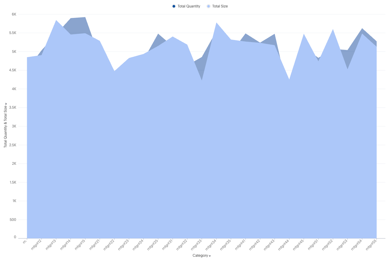
New area charts display quantitative data graphically. The area between the x-axis and the line are colored in to help you compare different portions of the chart.

Example image for an area chart

Your search needs at least one attribute and one measure to be represented as an area chart.

New area chart features

  • Complete flexibility to handle any combination of grouped or dual axes

  • Ability to apply color slicing even when multiple measures are plotted

  • New data-marker styles: square, wye, cross ..

Supported configurations

  • Multivariate charts

  • Multiple measure lines in a single shared axis

  • Multiple measure lines in a dual axis, where each measure line is a part of either axis

Automatic transformations

  • Shared axis - Automatically apply MN/MV for measures in a shared axis and auto apply identity transform

  • Dual axis - Automatically apply transform type == identity

Default chart recommendations

  • For two or fewer measures, use a dual-axis chart.

  • For three or more measures, use a multivariate chart.

Limitations

  • When color slicing is applied to multiple measures, the system automatically converts the visualization into a multivariate chart.

  • Shared axis configuration is not supported.

  • Dual-axis configuration is not supported.


Was this page helpful?