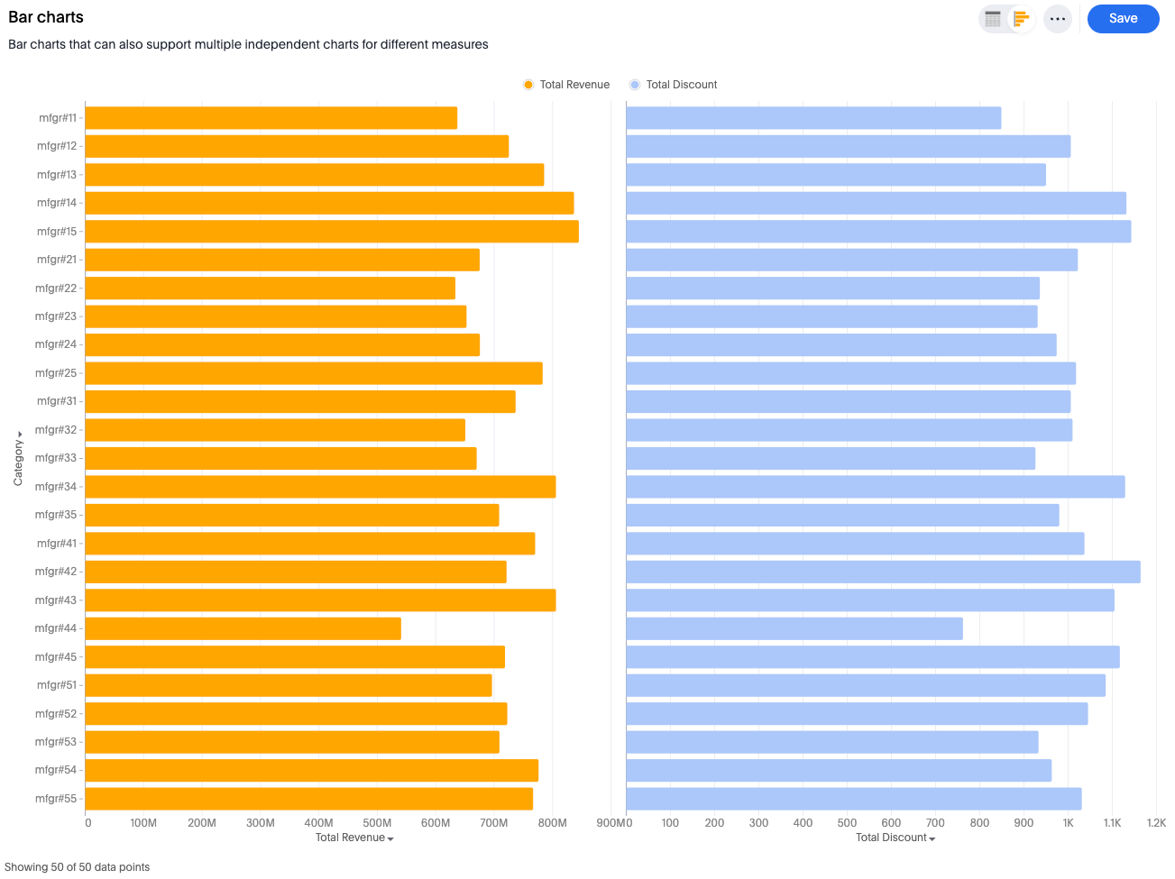
New bar charts
The new bar chart is very similar to the new column chart. The only difference is that it is oriented horizontally, instead of vertically.
Bar charts display your data using horizontal rectangular bars. The length of the bar is proportional to the data value.
Your search needs at least one attribute and one measure to be represented as a bar chart.
New bar chart features
-
Complete flexibility to handle any combination of grouped or dual axes
-
Ability to apply color slicing even when multiple measures are plotted
Supported configurations
-
Multivariate charts - Each measure is an independent smaller chart
-
Grouped bar chart for multiple measures - Each measure is a separate bar
-
Grouped bar chart for single measure - Each color slice is a separate bar
-
Multivariate-grouped bar chart for multiple measures - Small independent charts which belong to different measures, with the color slice of measure as a separate bar
-
Bullet chart - Each measure is a part of either axis in the dual-axis setup
Automatic transformations
-
Automatically apply measure name (MN) and measure value (MV) for measures in a shared axis and also apply group transform
-
Dual axis - Automatically apply
transform type == identity
Default chart recommendations
-
For two or fewer measures, use a grouped chart.
-
For three or more measures, use a multivariate chart.
Limitations
-
When color slicing is applied to multiple measures, the system automatically converts the visualization into a multivariate chart.