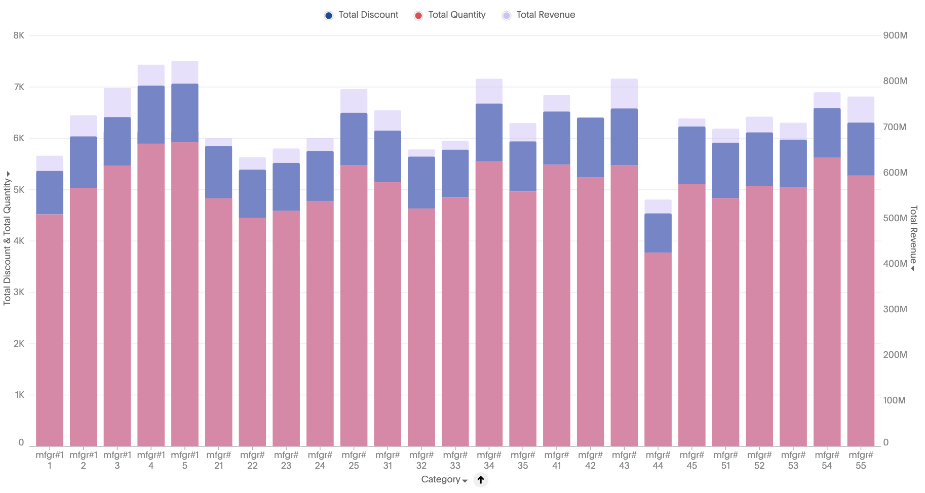
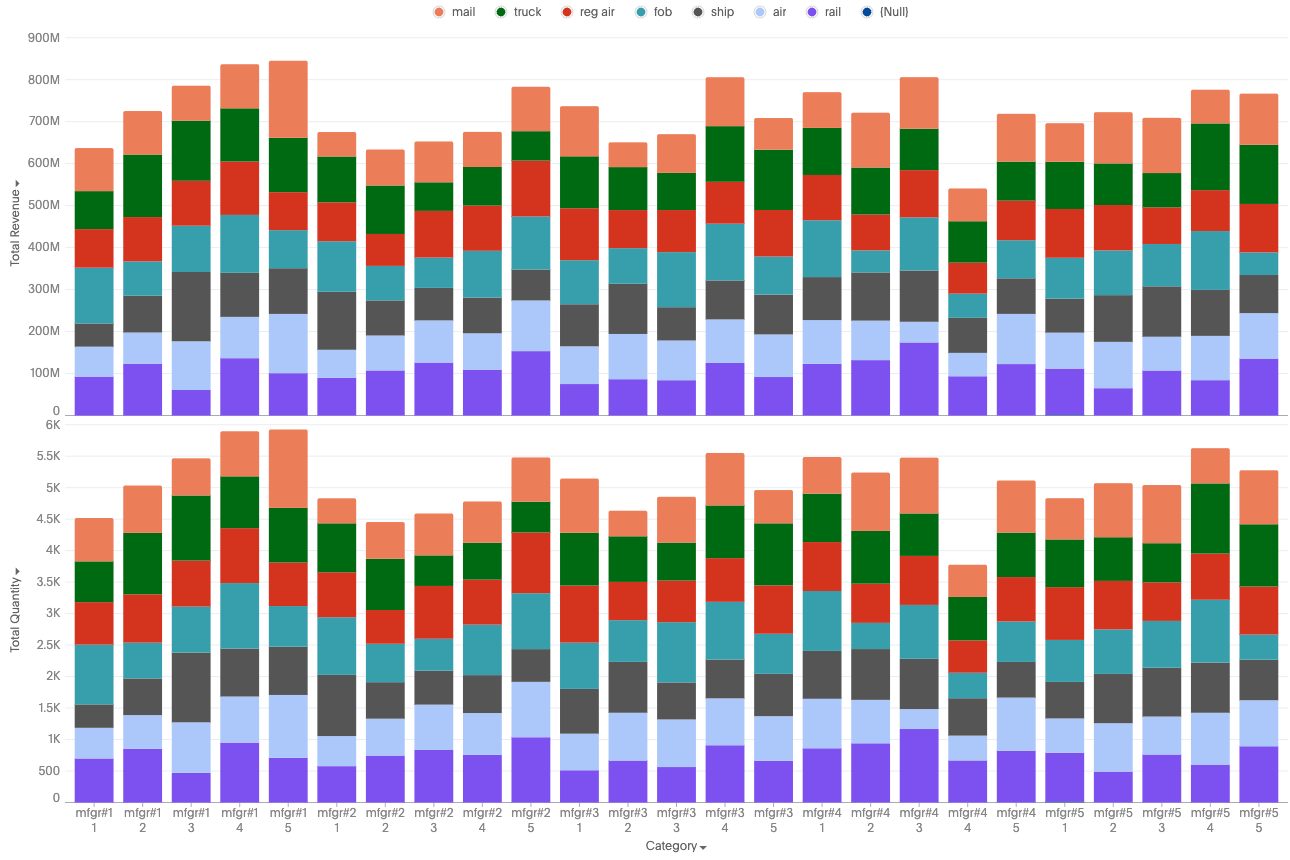
New stacked column charts
The new stacked column chart is similar to the new column chart, but with one major difference. It includes a legend, which divides each column into additional sections, by color. Note that you can only use an attribute to slice with color.
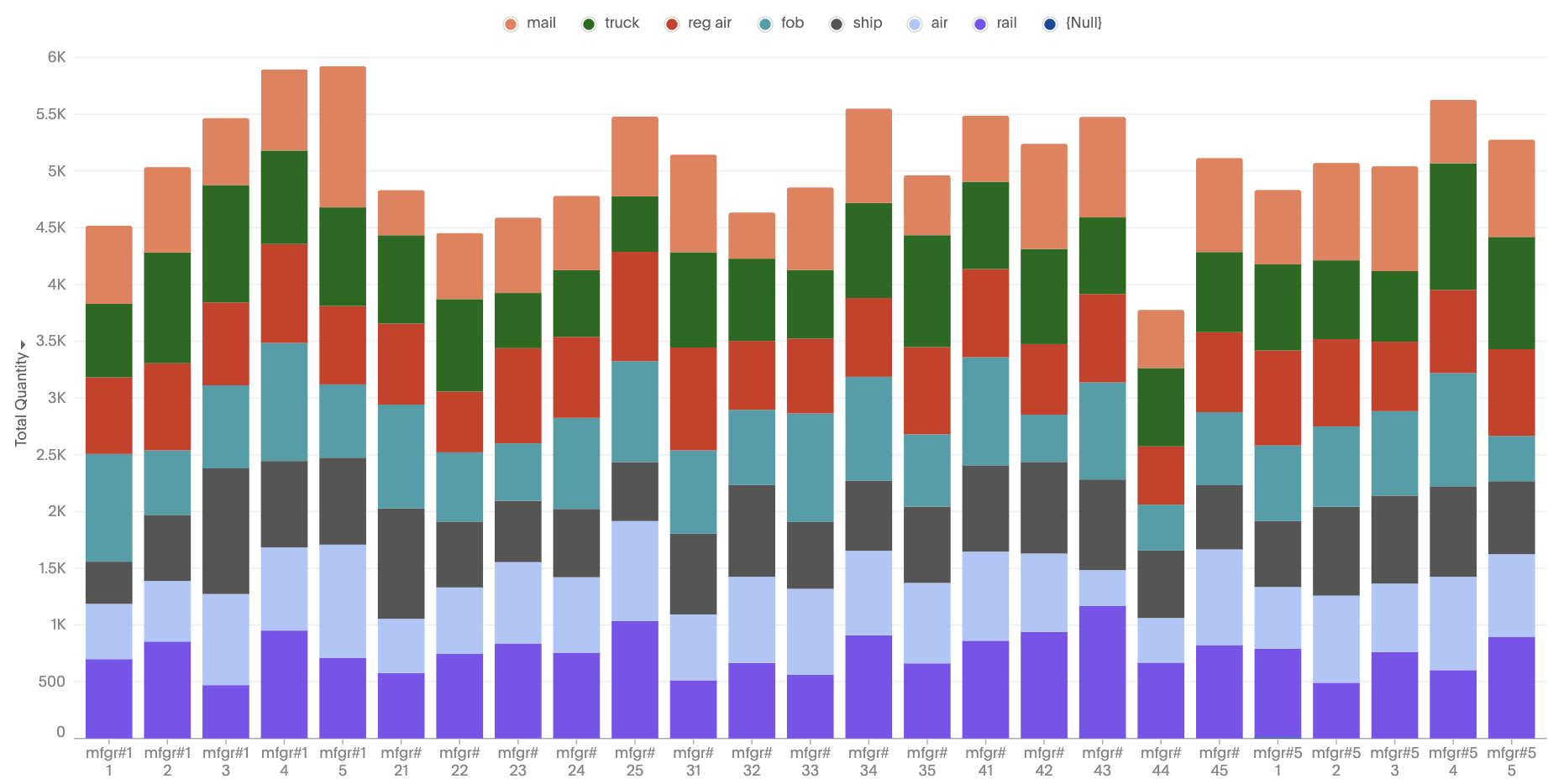
For any combination of attributes and measures, you will see a stacked column by automatically changing the configurations.
New stacked column chart features
-
Ability to apply color slicing even when multiple measures are plotted.
-
New settings to control column properties like opacity and width to create bullet charts.
Supported configurations
-
Single-measure stacked: Sliced by a single attribute using color.
-
Multiple-measures stacked: Measures are stacked on top of each other; no slicing by color.
-
Multivariate-stacked: Each measure forms a separate stacked chart
Automatic transformations (for stacking)
-
Single measure, slice by color present: Automatically stack the slices of the measure and apply a stack transform.
-
Multiple Measures, No Slice by Color: Move all measures into a shared axis (Measure Values construct), auto-apply stack transform on all measures.
-
Multiple measures, Slice by color present: Convert to a multivariate chart where each measure is sliced by the attribute, and a stack transform is applied to each individual layer.
Default chart recommendations
-
For two or more measures and one attribute, use stacked measures.
-
For two or more measures and two or more attributes, use a multivariate stacked chart.
Limitations
-
When color slicing is applied to multiple measures, the system automatically converts the visualization into a multivariate chart.
-
Shared axis configuration is not supported.
-
Dual axis configuration is not supported.