New charts library
ThoughtSpot’s new highly flexible charting library allows you to create and customize a wide range of visualizations directly within ThoughtSpot. The library enables pixel-perfect and highly customizable visualizations, and supports advanced use cases like trellis charts. Starting in the 26.7.0.cl release, the new charts library is generally available and supports the following 12 chart types:
These 12 chart types replace their classic equivalents, though you can switch any new chart back to its classic equivalent. Other chart types are not affected by this change and continue to use the existing classic library.
Starting in 26.7.0.cl, new charts replace the classic versions by default in the chart selector panel on all ThoughtSpot instances.
| The new charts will be enabled and made the default charts on all customer instances over a period of several weeks following the release. After your instance is upgraded to 26.7.0.cl, the new charts may not be available immediately. In that case, your instance will receive the update automatically as the rollout progresses. If you don’t want to wait, your ThoughtSpot administrator can enable them. For details, see Enabling new charts as default. |
All Answers created in Search Data, Spotter, and SpotterViz after upgrade to 26.7.0.cl will use new charts by default. Existing Answers that use a classic chart will continue to use the classic chart, but can be converted to a new chart. For details, see Switching between new and classic charts.
If you have questions about your instance’s rollout status, contact ThoughtSpot Support.
Why move to the new charts library?
With new charts, ThoughtSpot offers the following key features:
-
Wider flexibility and more granular control over all visualization aspects with multiple new settings across tooltips, data-labels, and axes.
-
Sophisticated charting capabilities like faceting, cross-tab, trellis, multivariates, dual axes, and more.
-
Overcomes existing limitations with charts. You can now plot multiple bar or column series within a single line-column chart, and apply attribute slicing even when you are using multiple measures on your Y-axis.
Axis types
In the new charts, ThoughtSpot supports several axis types and configurations:
Individual axis
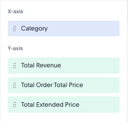
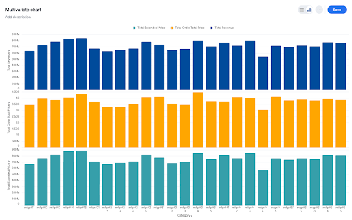
Use an individual axis when a single measure represents information on its own measuring line. These individual axes can be used to build multivariate charts which are perfect for visualizing multiple measures that have vastly different ranges or distinct business contexts without visual clutter. When multiple measures are added into the measure axis (Y-axis), the system detects ungrouped chips and automatically generates a dedicated chart section.
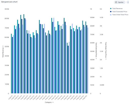
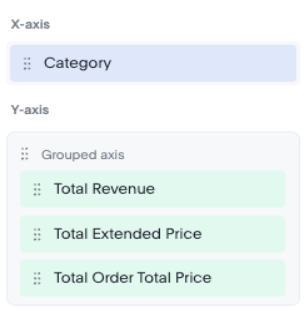
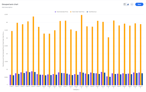
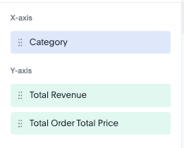
Grouped axis
Use a grouped axis when you need to add a second layer of dimension to your visualization. It allows you to compare sub-categories within a primary category side-by-side. For instance, when you want to see how different segments sold within a larger group. You are looking at sales by region, but you want to see which Product Category is driving the numbers in each specific region. In such a case, instead of one bar per region, you get a cluster of bars (one for each product) for every region on the X-axis.
A grouped axis is considered as a single entity.
To create a grouped drag a measure chip onto another measure or drop it into an existing group to merge them. An encompassing container immediately wraps the measures, signaling that they are grouped and will share a unified axis scale.
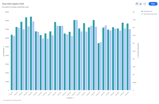
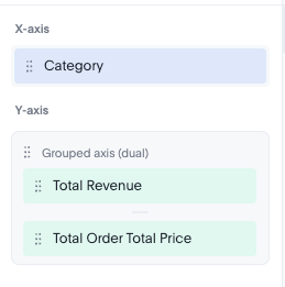
Dual axis
Use a dual axis chart to plot two different measures on the same chart using two separate Y-axes—one on the left and one on the right. These entities on the Y-axes can either be a group or a standalone measure. Dual axis is very useful when you want a performance metric, like goal versus actual.
Chart modes
ThoughtSpot currently supports these new chart modes in its enhanced charting library:
Facets
Facets partition the chart into a hierarchical grid of sub-sections. Instead of forcing multiple dimensions onto a single, crowded axis, Facets nest your data into distinct, side-by-side modules. This results in enhanced readability, and you can scan complex, multidimensional relationships instantly.
Faceting will be the default behavior when there are ≥1 attributes in the X-axis. You cannot create a concatenated single axis.
Trellis
Trellis charts, also known as small multiples, are a series of similar graphs arranged in a grid format, where each individual panel displays a different subset of a dataset using the same scale and axes. By partitioning data into manageable chunks, these charts enhance scalability and ensure clarity by preventing a single view from becoming overloaded. The side-by-side layout drives improved comparisons, making it easy to spot emerging patterns or trends across complex datasets. Furthermore, granular customization settings provide total control over subplot aesthetics, from titles and borders to specific color schemes, ensuring the final output is both professional and precise.
Dragging an attribute in the trellis section, will create these small multiples based on the values of the attribute.
Important changes starting in 26.7.0.cl
This section describes significant changes in the new charts library that are introduced in the 26.7.0.cl release.
-
Axis configurations
-
Visual differences
-
Chart settings
-
Admin chart styling
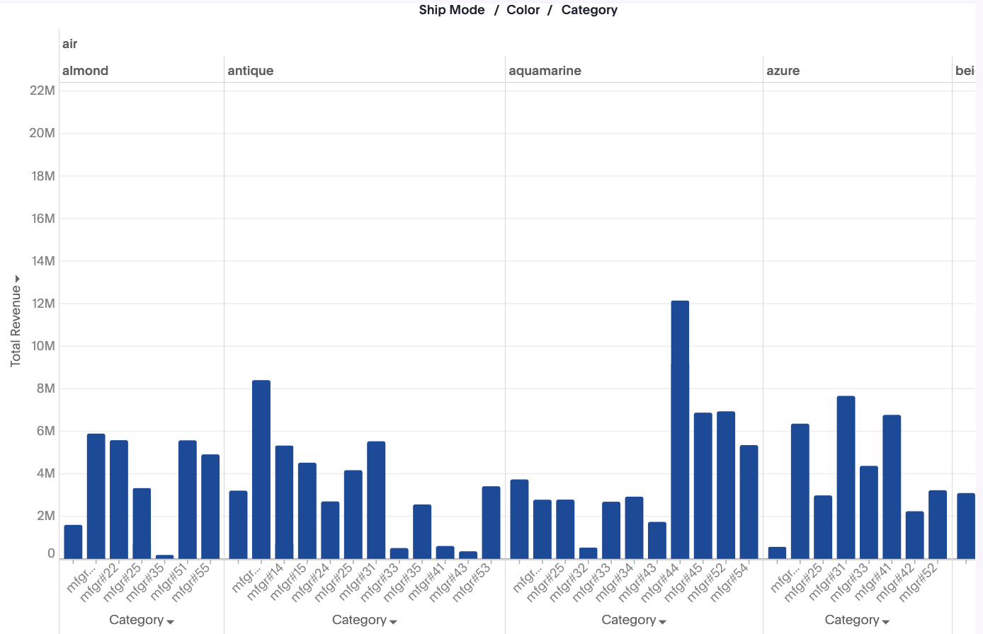
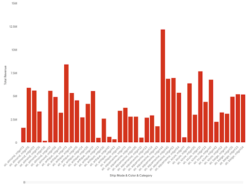
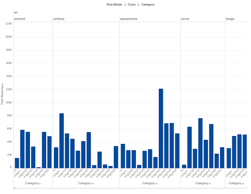
Facets instead of a single axis
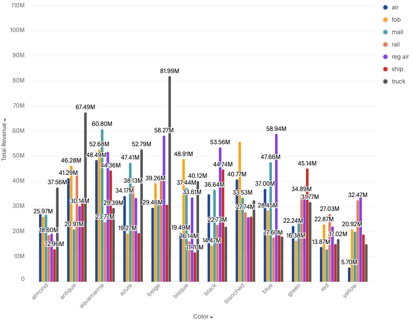
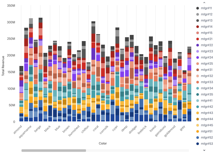
A query utilizing multiple attributes on the X-axis (e.g., Revenue | Category | Color | Ship Mode) now generates a faceted chart. This change introduces mini-grids for each attribute, significantly improving data readability. You can achieve a single axis by using a formula to concatenate the axis fields.
Classic chart:
New chart:
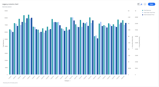
N-Axis no longer supported
-
Classic charts supported multiple Y-axes (N-axis), allowing one axis per measure.
-
New charts are limited to a maximum of two axes.
-
To visualize bars side-by-side, all related measures must be grouped into a single axis entity.
-
Manual selection of axis positions (left/right) is no longer available.
Classic chart:
New chart:
No more multiple slice by color
-
Classic charts allowed multiple attributes for the 'slice by color' function.
-
New charts restrict 'slice by color' to a maximum of one attribute.
-
To incorporate multiple fields, users must first concatenate them using a formula, and then apply that formula to the 'slice by color' setting.
Classic chart:
New chart:
New axis types
Multivariates:
-
Individual dimension chips now automatically create multivariates, replacing the former N-axis grouped charts.
Classic chart:

New chart:
Grouped axis:
-
Users must explicitly create a grouped entity, either by dragging one chip onto another or by utilizing the axis configurator menu.
-
Grouped bars do not support N-axis configurations; they must be represented as a single axis entity.
Classic chart:
New chart:
Dual axis
-
When explicitly used, the dual axis feature now superimposes measures.
-
In contrast to the classic version that has dual axes that are grouped or side-by-side bars, the dual axis functionality in the new version is capable of creating bullet charts.
Classic chart:
New chart:
This section describes the visual differences in the new charts library that are introduced in the 26.7.0.cl release.
Column / Bar chart differences
Difference between classic and new charts:
-
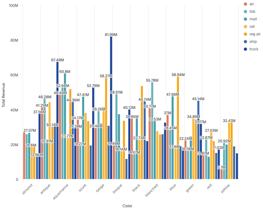
Y-axis ranges are different for both the charts.
-
Number of data points. (For example: The number of bars visible in the viewport vary for old and new charts.)
-
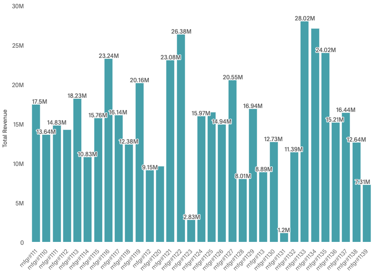
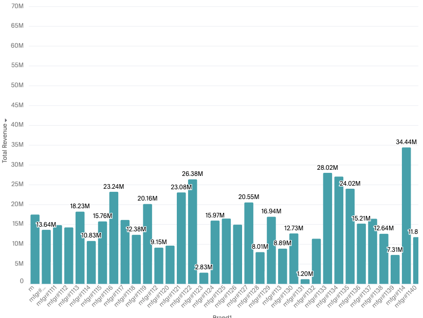
Data labels displayed can vary. (For example in old charts, the first label 17.5M is visible but in new charts it’s not visible due to a difference in collision logic.)
-
Differences in axis scale calculation. The old charts dynamically change axis scales when you scroll vs new charts create axis based on the complete data and hence the difference in Y-axis i.e. 40MN vs 65MN
-
There are some subtle visual differences as well. (For example: Data labels appear slightly darker, and bars appear slightly curved in the new charts.)
Classic chart:
New chart:
Line chart differences
Difference between classic and new charts:
-
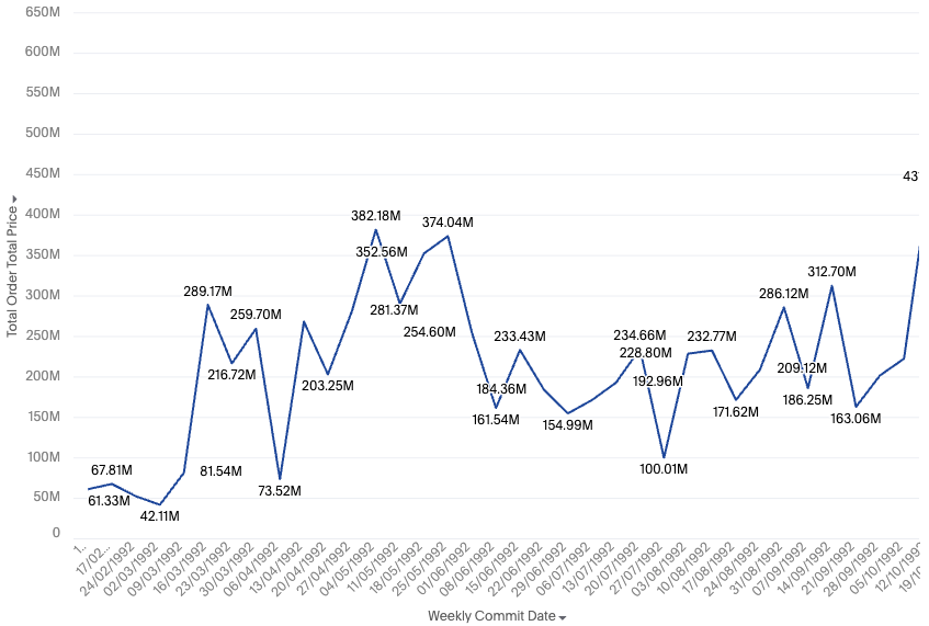
Y-axis ranges are different for both the charts - i.e. 500MN and 650 MN
-
Number of data points. (For example: the old chart shows data up until 1992 and the new chart shows data up until 1993 in the first available viewport.)
-
The axis labels are different. (For example: the old chart shows selective timestamps and the new charts try to show as many timestamps as possible, like all the weeks in the below example.)
-
The orientation of axis labels can differ. (For example: horizontal vs slant on initial render, which can be controlled from settings.)
Classic chart:
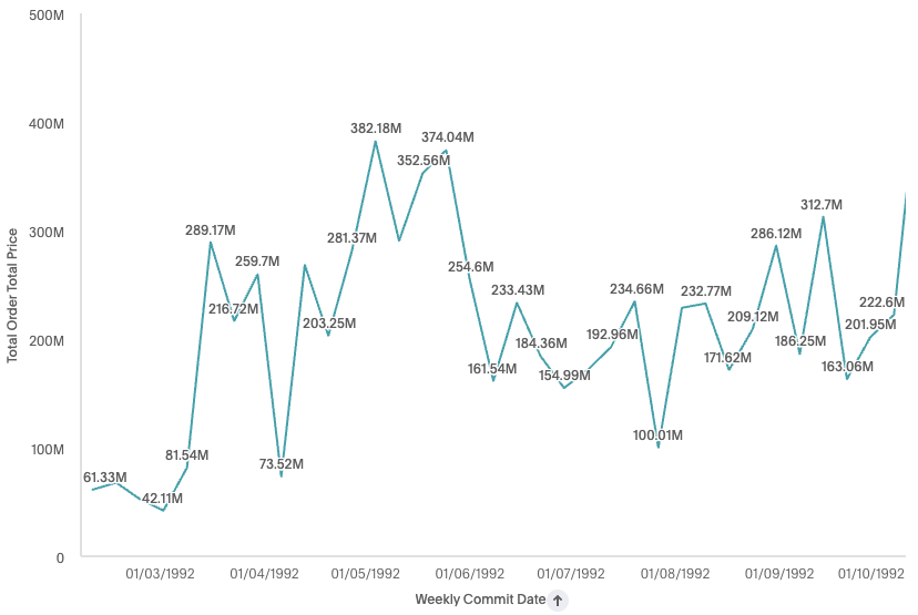
New chart:
Sliced chart differences
Difference between classic and new charts:
-
The legend items have a small white border and the spacing between the items is not equal i.e. both legends span different heights.
-
There is a default padding between x-axis items. (a white space between each color on the new chart compared to old chart bars starting immediately one after another, which can be controlled through settings.)
-
Data label collision logic is different. Different data labels are visible across both classic and new
-
Sliced bar widths also vary slightly. (For example: Bars on left are thicker than on the right.)
Classic chart:
New chart:
Stacked chart differences
Difference between classic and new charts
-
Bar widths differ slightly.
-
X-axis labels / ticks differ. Classic charts show alternate / skipped ticks, and new charts accommodate the maximum possible axis labels.
Classic chart:
New chart:
While new charts introduce several enhancements, certain settings from the previous version are no longer supported.
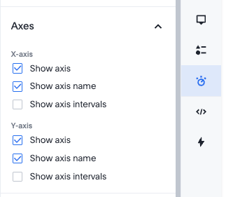
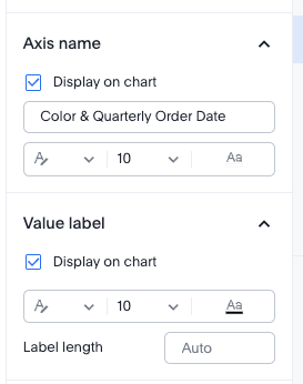
Axis show / hide settings
-
Classic charts provided the option to hide names and labels for individual axes.
-
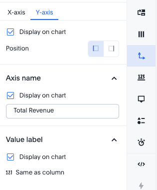
New charts apply axis visibility settings universally across all axes. This setting has been relocated from the individual column configuration to the general display settings.
Classic chart:
New chart:
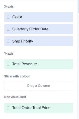
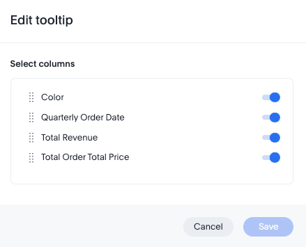
Non-visualized fields in tooltip
-
The ability to add non-visualized fields to tooltips is not supported in the new charts.
Classic chart:
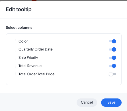
New chart:

Label settings
-
Custom font size settings for elements such as data labels and axis labels are no longer supported.
Classic chart:
New chart:
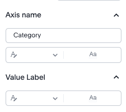
Data-Label settings
-
Certain settings, including label length and label background color, are no longer supported.
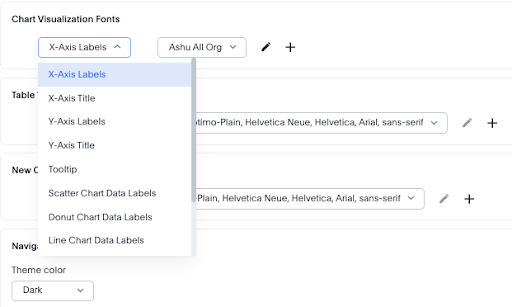
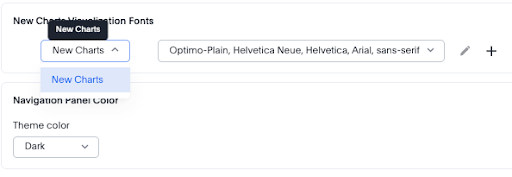
In addition to the admin portal, these settings are also available in Develop > Styles. You can no longer set granular custom fonts across different chart elements in the Admin portal.
Old:
New:
Enable new charts as default
A ThoughtSpot administrator can set the new charts to appear in the Library section of the chart selector panel by using the Set new charts as default toggle in the Admin portal.
How it works
When enabled:
-
Only the new versions of the charts are accessible in the Library section of the chart selector panel.
-
You can switch a new chart used in an Answer to the classic version. For details, see Switching between new and classic charts.
When disabled:
-
New charts are still accessible in a collapsed New section above the Library section in the chart selector panel.
-
Classic charts are recommended for all new Answers.
-
Answers that were already created using new charts remain fully functional and accessible.
-
New charts cannot be set as default while this toggle is off.
This setting affects your entire instance and is not configurable per organization. To fully disable the New charts, contact ThoughtSpot Support.
Switching between new and classic charts
You can switch a chart in an Answer between the new and classic library by doing either of the following:
-
To switch from a new chart to a classic chart, go to the More menu
 and select Switch to classic chart.
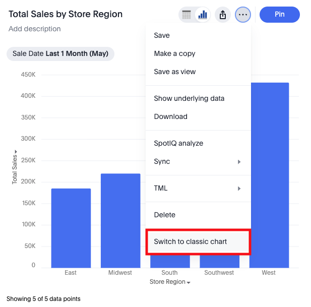
-
To switch from a classic chart to a new chart, go to the More menu
and select Switch to new chart.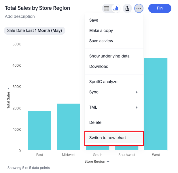
|
When you switch chart types, a warning dialog confirms that your existing chart configuration settings will not carry over. Review this warning before confirming the switch. |
Editing and copying classic charts
If you open and edit an existing classic chart after new charts are enabled, the chart continues to render as a classic chart and all editing actions remain available. The chart type label in the chart selector panel reflects the type you selected (for example, column or line), regardless of whether the chart uses the new or classic library.
|
If you edit a saved classic chart and then change its chart type using the chart selector panel, the chart switches to the new chart of that type — not the classic version. For example, if you open a classic column chart and select Line in the chart selector, the result is a new line chart, not a classic line chart. |
When you copy a classic chart, the copy is also a classic chart. You can perform all editing and configuration actions on the copied chart.
Limitations
-
SpotIQ analysis is not available for new charts.
-
Limited style customization options for embedded users.
rules_UNSTABLEis not supported for these charts, so users cannot directly target any element and apply styling on that class. The classic charts do support this. -
Non-visualized fields cannot be added to tooltips.
-
The following data limits apply for a ThoughtSpot instance:
-
# of trellis charts: 50
-
# of facets: 1000
1000 is calculated as the product of cardinalities of all the attributes (except the last one) on the primary axis.
-
FAQs
Are my existing charts automatically migrated?
No, they will not be auto migrated.
Can I switch from new charts back to classic charts?
Yes. You can switch any individual chart back to the classic library by selecting Switch to classic chart from the chart’s three-dot menu on the Answer page. Most configuration settings may not carry over when switching. A warning dialog appears before the switch is confirmed.
What happens if an administrator disables new charts?
When an administrator turns off Set new charts as default in the Admin portal:
-
New charts are still accessible in a collapsed New charts accordion in the chart selector panel.
-
Classic charts are recommended for all new answers in Search Data, Spotter, and Spotter Viz.
-
Charts already created using new charts remain fully functional without restrictions.
-
New charts cannot be set as default while the toggle is off.
To fully remove the New charts accordion, contact ThoughtSpot Support.
Why are multiple attributes no longer combined into a single axis?
Combining multiple attributes into a single axis can hide patterns and make comparisons difficult. The new charts use faceting to present each attribute clearly, improving interpretability across dimensions. With the new charts, however, you can concatenate the required fields in a formula and make a single field.
Why do charts support only two axes?
Supporting more than two axes significantly reduces readability and increases the risk of misinterpretation. ThoughtSpot limits charts to two axes to preserve analytical clarity.
Why does time-based sorting behave differently?
Datetime fields are treated as continuous rather than discrete. This preserves accurate trend analysis in line and area charts, where sorting time buckets can distort patterns.