New heatmap charts
Heatmap charts use color intensity to represent data values in a two-dimensional matrix. They are effective for identifying patterns, correlations, and anomalies in large datasets, and are commonly used for visualizing correlation matrices, geographic data, time-based patterns, and categorical comparisons.
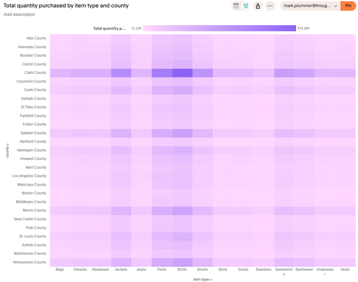
|
Heatmap charts are available as part of the new charts library Early Access rollout. Contact ThoughtSpot Support to enable this chart type on your instance. |
Data requirements
To create a Heatmap chart, you need:
-
At least one measure
-
At least two attributes (one for each axis of the heatmap matrix)
New capabilities
The new charts library heatmap chart introduces the following capabilities not available in the classic version:
-
Faceting and Trellis chart modes — Partition Heatmap charts into faceted grids or trellis small multiples for multidimensional analysis.
Behavior changes
When migrating from the classic Heatmap chart to the new charts library version, note the following changes:
-
Gridlines and padding between bands — Gridline and band padding behavior is planned for update in the new renderer.
-
Custom font support — Custom font settings apply differently compared to classic charts.
-
Null and empty handling — Null and empty values are handled differently in the new renderer.
-
Non-visualized fields in tooltip — Adding non-visualized fields to tooltips is not supported in the new Heatmap chart.
Limitations
The following features are not supported in the new Heatmap chart:
-
Data label alignment (low priority feature)
-
Data label styling and text backgrounds, borders, and alignment
Configure a Heatmap chart
To create a Heatmap chart:
-
Start a new search or open an existing Answer.
-
In the chart selector panel, select Heatmap.
-
Add at least one measure and two attributes to your query.
-
The chart renders a color-coded matrix based on your data values.
-
Use the chart settings panel to configure color scales, faceting, and trellis options.