New pareto charts
Pareto charts combine a column chart and a line chart to highlight the most significant factors in a dataset. The columns represent individual values in descending order, and the line shows the cumulative percentage, helping you identify the vital few contributors that account for the majority of effects.
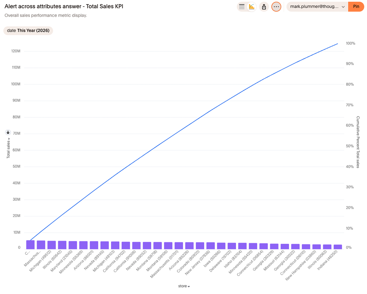
|
Pareto charts are available as part of the new charts library Early Access rollout. Contact ThoughtSpot Support to enable this chart type on your instance. |
New capabilities
The new charts library Pareto chart introduces the following capabilities not available in the classic version:
-
New axis configuration logic for multivariates and grouped axis — Build complex multivariate Pareto charts with improved axis handling.
-
Faceting and Trellis chart modes — Partition Pareto charts into faceted grids or trellis small multiples for multidimensional analysis.
Behavior changes
When migrating from the classic Pareto chart to the new charts library version, note the following changes:
-
Multiple attributes create facets — When you add multiple attributes to a Pareto chart, the new renderer creates facets instead of combined slices. This is consistent across all new charts library charts. You can use a formula to concatenate fields if you need a single combined axis.
-
Bar width settings unavailable — Group padding and bar padding settings are not available in the new Pareto chart. This is consistent with other new charts library charts.
-
Custom font support — Custom font settings apply differently compared to classic charts.
-
Null and empty handling — Null and empty values are handled differently in the new renderer.
-
Non-visualized fields in tooltip — Adding non-visualized fields to tooltips is not supported in the new Pareto chart.
Limitations
The following features are not supported in the new Pareto chart:
-
Data label styling and text backgrounds, borders, and alignment
Configure a Pareto chart
To create a Pareto chart:
-
Start a new search or open an existing Answer.
-
In the chart selector panel, select Pareto.
-
Add at least one measure and one attribute to your query.
-
The chart automatically sorts values in descending order and displays the cumulative percentage line.
-
Use the chart settings panel to configure faceting, trellis, and axis options.